1 min read

Community Author
Contributor
In just four tweets, Brian Oblinger addressed big challenges most leaders have when presenting options to stakeholders. For clarity, easy comparison, and the tiniest nudge toward your preference, try a Good/Better/Best chart.
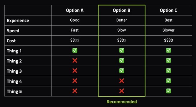
With the right layout, not only will you clearly call out the biggest differences among the available options, you'll also frame your top choice more objectively to (hopefully) get more people on board.
In a quick thread, Brian attributes the success of said chart to just three things:
- The ordering of options
- Usage of iconography and color
- The recommendation highlight
None of it's meant to trick anyone, simply to empower more informed decisions! And if that decision ends up not being your rec, you'll have a docs to look back on later.
Get more context from Brian's Twitter thread and give the Good/Better/Best chart a shot next time you're looking for buy-in.
We think you'd like these

How to build a community operations team
Mar 6th, 2023·12min readCommunity
The soft skills every community manager needs
Feb 3rd, 2023·7min readCommunity
Uncommon Conversations: An Interview with Erica Kuhl, CEO & Strategic Community Consultant
Oct 27th, 2021·14min readCommunity
Pricing for everyone: introducing simplified pricing for every go-to-market team
Apr 23rd, 2024·4min readCommunityProduct