Measuring the return on investment (ROI) of community initiatives is essential to prove the impact of a program and build a shared vision among stakeholders.
However, aligning the expectations of different leaders can be challenging. Community is too often considered a “nice to have” when it should really be thought of as a key growth engine for companies looking to strategically and sustainably grow revenue.
One way to drive alignment and success is by identifying key goals and markers that will be used to measure progress. This article will lay out the steps to drive stakeholder understanding of the importance of community to the organization.
The difficulties of conveying community ROI
Why doesn’t community always get the attention it deserves? Articulating the impact of user communities has historically been a challenge, and executives who are less versed in community often need to be educated on the benefits of investing in a community-growth strategy.
Measuring the ROI of community can be difficult for several reasons:
- Difficulty in capturing the scope: Users, prospects, and customers engage with an organization across a multitude of channels including Slack, GitHub, Twitter, LinkedIn, Discourse, and more. Tracking, measuring, and tying all of these sources back to community ROI can be challenging.
- Complex attribution models: It can be difficult to determine how much of a company's revenue can be attributed to a user community versus other marketing or sales channels. New tooling in the community space is helping tackle this challenge.
- Long-term impact: The benefits of user communities grow over time, and therefore, they are often seen as long-term investments. Still, there are short-term benefits to the business that come from community engagement that should not be overlooked.
For community leaders, these barriers can make having a conversation about community ROI challenging. To find success, you’ll want to:
- Clarify the relationship between community and ROI
- Track metrics and analytics that draw a clear line to ROI
- Collect and report on your ROI insight
Clarify the relationship between community and ROI
Properly aligning expectations for community from the outset is important because every stakeholder and executive has a different perspective about community and its potential impact on the business.
For example, when Joshua Zerkel, head of global engagement marketing at Asana, embarked on the company’s community-building journey, he met around 20 key stakeholders and asked them what they wanted to see out of the program. It’s a good thing he did because each leader had different expectations. Guided by those conversations, Josh was able to align everyone on a set of shared key goals and identify the markers that would be used to track progress in achieving those goals.
Like Josh, community leaders must get everyone on the same page as to the hoped-for business impact of a community investment so that executives and other stakeholders are able to properly prove the return on that investment.
If you’re looking for help on aligning expectations, we’ve prepared this self-guided exercise that offers insights into your goals as a community or DevRel professional, your community goals, and the goals of your business goals so you can align expectations with stakeholders early to better build a shared vision.
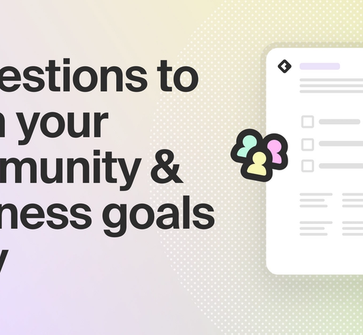
Unlock access to the self-guided alignment exercise
Track metrics and analytics that draw a clear line to ROI
One of the clearest ways to demonstrate the value of community is using metrics and analytics. Surfacing, tracking, and presenting the right metrics and analytics can help reveal how community is indispensable as it contributes to business growth.
These include:
- Community health metrics and analytics
- Business metrics and analytics
- Benchmarking
- Surveys and focus groups
Community health metrics and analytics
Community health metrics and analytics can be used to measure the progress and success of your community efforts. Proving that your community is hitting its own growth or engagement goals is a foundational step that must be taken in order to connect community to business ROI.
Relevant health metrics, analytics, and insights that accrue to business returns include:
- Overall community activity
- Key members to nurture
- Trending activity
- Important organizations
Overall community activity
Measures related to overall community activity deliver an at-a-glance look at how engaged members are within the community. These include the percentage of posts with at least one reply, average response time, and percentage of responses by community members vs. team members’ responsiveness rates.
These data points (in aggregate known as responsiveness) reveal to what extent members respond to another’s queries or conversation prompts. In a vibrant community, members will engage with one another, requiring few nudges or answers from company reps/community managers.
Tracking overall community activity lets you know if your community growth efforts are working, which enables future community-led growth and a clearer line to community ROI.
Key members to nurture
Nurturing one-on-one relationships within the community encourages deeper member engagement. These individuals are more likely to give back—like answering questions and taking part in discussions—increasing the overall value of your community to members and your business.
Being able to identify key members to nurture is critical as you build stronger relationships that benefit both the community and your organization. These members are often your biggest community champions, product advocates, or potential customers.
Common member types to look out for include:
- New and active members: A member who recently joined your community, say in the past week, and is already actively posting questions and engaging in discussion. Find out what caused them to join and what they’re looking to get out of the community to keep them actively participating.
- Inactive members re-engaging: Watch for when long-standing members who had gone dark reemerge. By understanding what inspired members to return to the community, you could learn ways to better sustain engagement within your community.
- Most active this week: Dig into what’s driving their activity—maybe they released an open source project and are looking for feedback—and then highlight this member and their work across your channels. Or say thank you by sending them swag.
- New members with social reach: Those with, say, 500+ Twitter followers or 100+ GitHub followers. Given their potential influence, it's worth diving into the type of content and information they're sharing about your product.
Trending activity
Your community is an incredibly valuable source of information and insights. Members engage in a variety of conversations on an array of topics: asking for help, sharing product feedback, exchanging new ideas, and more. You need to be sure the content and support you’re lining up for the community matches these needs. Staying on top of the trending topics in your community helps you feel confident in this alignment.
Insight into these topics also provides valuable feedback to team members across marketing, support, sales, product management, and engineering. It can inform product priorities, validate which messages are landing in the market, surface top user pain points, and more.
Important organizations
Identify the organizations (i.e., workplaces or accounts) where your community members work.
If data shows you have a number of members employed at a particular company, then it could be worthwhile to alert internal teams like success and sales about an opportunity to develop a relationship with that organization.
Business metrics and analytics
Business metrics and analytics speak directly to the bottom line and, as such, create the clearest tie to ROI. Even if the community-specific tie-in is new, executives and stakeholders will already be familiar with the fundamentals of these concepts and will have an easier time understanding their relationship to business impact.
Top business metrics and analytics to showcase the impact of community include:
- Community-attributed revenue
- Deal acceleration
- Product usage and program-driven feature adoption
- Regional presence and investment
Community-attributed revenue
Community-attributed revenue is defined as revenue from an organization whose member(s) engaged in the community before they appeared in your CRM or marketing automation system (like Salesforce, HubSpot, or Marketo). For example, a prospect or free trial user might join your community and then later become a paying customer for your product because of the peer guidance, resources, or support they received.
Community-attributed revenue allows you to clearly articulate how community is contributing to your organization’s closed pipeline.
Learn how Common Room empowers you to measure this end-to-end attribution from community member to closed deal.
Deal acceleration
Business leaders look to decrease the time it takes to convert a prospect to a customer. Your community is a place where prospects can get the information and resources they need to make a buying decision through engaging with current customers and your team. Comparing deal time to close between community-engaged and unengaged organizations can show how involvement in community increases prospect confidence and leads to faster close.
Using Common Room, one customer found that 72% of deals that began in community closed within 90 days. For sales and marketing-led deals, only 42% of deals closed within 90 days.
Product usage and program-driven feature adoption
Engaged community members are often engaged product users, especially in a community of product. Similar to the above, you can compare product usage data from individuals or organizations who are engaged in the community vs. not to see how this engagement drives product use. Together, community engagement and product usage can be powerful early indicators where a company might be ready to expand (if these measures are high) or about to churn (if these metrics have dropped off).
With the right community tooling and analytics, you can also bring together community and product data to explore the impact of specific community programs like feature launches or events. For example, you can look at users who attended a specific feature workshop to understand if it resulted in a corresponding uptick in using the product.
Regional presence and investment
Geographically, where are your community members located? And which regions have the highest conversions of community members to customers?
By tracking regional populations and conversions, business and community leaders can make more informed decisions about future investment like community team staffing, marketing spend, sales territory carving, and more.
Benchmarking
Benchmarking, or comparing your metrics and analytics to others in your industry, can also reveal the effectiveness of your community efforts. Whether you’re doing better than average in responsiveness or below average in total headcount, benchmarking against peers helps you better articulate to executives and stakeholders just how well your investments are faring.
Not sure where to find these industry figures? You’re in luck as we’ve put together 360: The Community-Led Growth Report. The report offers insights into 141 communities at various stages of longevity, maturity, and growth. The research highlights trends and inflection points across a cumulative 7.5+ million community members, which you can use to guide you in benchmarking.
Key takeaways include:
- The two most common surfaces that community members engage across are Twitter (91%) and GitHub (67%). Slack (52%) and Discord (36%) are also popular tools used to communicate with community members.
- Community members respond to each other more frequently (28%) than an organization’s internal teams (13%). Excluding GitHub, community response rates are significantly higher than team response rates.
- Community accelerates deals and drives new business. 72% of community-led deals closed within 90 days compared to 42% of sales and marketing-led deals. 27% of opportunities originated in the community versus other traditional sales and marketing channels.
- The average engagement rate across all community surfaces is 2%–12%. Smaller communities tend to have higher engagement rates.
Read all the insights in 360: The Community-Led Growth Report.
Surveys and focus groups
By conducting surveys and focus groups, community leaders can gauge what matters most to their members. While this is a more manual effort, it can provide valuable insights that shape the activities of the entire organization. For example, a survey might reveal that community members are interested in deeper integrations over new features, and so the company might redirect engineering resources to creating these integrations and initiate a marketing campaign to advertise them.
While the surveys and focus groups themselves may be a person-to-person exercise, you can still benefit from embedding technology into your efforts. A platform like Common Room can help you quickly find and group relevant members by region, role, industry, programming language, product usage, and much more.
Additionally, Common Room topics—which uses AI to surface what’s being discussed across your community into a digestible format—can help you find members talking about a specific subject, or give you conversation ideas for your focus group.
Collect and report out on your ROI insight
You know the metrics and insights you want to use to measure ROI, now what? You’ll want to be able to quickly and reliably report out on your results to stakeholders and executives to drive a conversation on community’s impact.
Today, you may be doing this manually by going to each community channel and pulling data into a spreadsheet or presentation to calculate and showcase results—a laborious and time-consuming process. We built Common Room to make reporting automated and customizable, so you can advocate for your program with data while spending your time on strategic community-building activities.
Common Room collects data from various sources such as your community channels, social media platforms, and CRM to provide a comprehensive view of your community members and their activities. Through robust reporting, you can gain insights into essential metrics discussed above that reflect the health of the community and the impact on your organization.
Try Common Room out for free today or request a demo to see the platform in action.
For an example of how a top community-led organization demonstrates community impact to stakeholders, check out this post on Asana: What you can learn from Asana’s data-driven approach to measuring community impact.
To chat and exchange tips with 1500+ community and DevRel leaders on how they measure and showcase the success of their programs, join us in the Uncommon Community Slack.